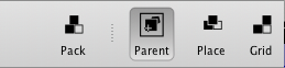
Command is the common Goolbar control. Also use »command« for embedded windows or interactive vectors.
The command item behaves in the same fashion a push button does. The »activeForeground« is displayed while the first mouse button is clicked on its caption or icon. The icon will not normally partake in active colour changes.

In addition, the icon and caption are moved slightly to the right and down; giving the impression of a depressed state.
The assigned »command« is executed after the first mouse button was released on the command’s premises.
A checkbutton looks similar to a command, but is layered on top of a rectangle. The colour of the used rectangle is specified through the Goolbar »-selectColor« property. In their inactive state radiobutton and checkbutton look entirely the same as a command. The toolbar does act as white space ; again identical to a menu, where all the elements except their indicators fade into the white space created by the menu window.
TkPath gradients are allowed for »selectColor«. The previous colour will be used for the deprecated items menu.
It can happen that a TkPath before 0.2.8 gradient gets deleted while still in use by a Goolbar. In this situation no items are rendered at all on-screen. The only option is to set the »selectColor« back to a solid colour. This situation may arise by establishing a new window hierarchy –starting with .(dot).
Otherwise, the Checkbutton behaves and looks identical to Command.
The Radiobutton is visually identical to a Checkbutton.
Separators and Variable Space are irregular items.
The Separator is drawn as a dotted line (┊). Inside the Gooleditor it features a caption "Separator".
Separators are defined with the »show« property by inserting a | character –a vertical line.
Variable Space is defined the same fashion as a Separator. It’s symbolized through a ~ (tilde) character in the »show« property.
Be careful with variable space! Variable space does only work properly in single line toolbars and shall not be used within a Galette
Variable space is used to align parts of the Goolbar items to the right, while the remainder is left oriented. It does not work well with »columnbreak«.
Example 2.7. Separators and Variable Space
# Customize show to select what is displayed:
    .toolbar configure \
        -show { ida | idb ~ idc | idd ide}