Property Details:
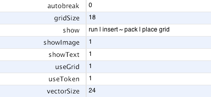
- autobreak
Either 0 or 1. Default is 0 (false/off). Tells the Goolbar to break the items into multiple lines.
In addition, line break can be controlled by defining »columnbreak« for an item.
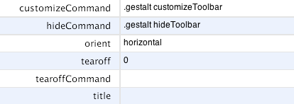
- customizeCommand
A toolbar customization function.
The »customizeCommand« will be accessible from the Goolbar context menu.
- font
Every »label« (caption) is rendered in this »font«.
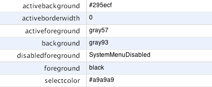
- selectColor
The colour used to indicate the selected states of radiobuttons and checkbuttons.
A TkPath gradient can be used as the »selectColor«
The previous colour is used for the deprecated items menu, if a gradient is specified for »selectColor«.
Predefined gradients can be used with TkPath 0.2.4 to 0.2.8, only.
- show
The »show« property is the Goolbar worker property. »show« controls the visibility of items and it is the only way to create – or rather assign– separators and variable space.
The show property works in tandem with the add command. Every newly added item is visible on default. Unless »show« was set prior to »add«.
- showImage, showText
Controls the visibility of icons and captions.
- tearoff, tearoffCommand, title
Tear-off and floating window settings
The Goolbar is a template and can be created as a 'frame' or a 'toplevel' window –as every Runtime Library based template.
The tear-off mechanism allows to alter the Goolbar from embedded to a floating window and vis-versa.
Only the 'grid' geometry manager is supported by the tear-off functionality.
Do not use 'pack' for any dialogs anyway! The layout of an area using the 'pack' geometry manager depends on when its clients are added to the region. This causes trouble with interactive layouts –Goolbar tear-off and »fallback«.
- vectorSize
The »vectorSize« property gets propagated to the embedded canvas graphics based vectors.
In the future: Vectors, glyphs and images may become fully interactively resize able –while using a scroll-wheel. This requires, that all vector elements originate from TkPath.
- gridSize
Defines the minimal space allotted to a single item. Each item will use discreet multiples of »griddedSize«.
Gridded size is used to create a toolbar with even distributed items. Regardless of different icon and caption -size.
A larger »griddedSize« might reduce the needed space for a series of items.
- activeBackground, activeForeground, background, foreground, disabledForeground
Colours used by the Goolbar.
»foreground« is used to render the »label« underneath the icon.
»disabledForeground« is used for the disabled item »state«. The icon and caption are stippled; or in the presence of TkPath semi-transparent.
A disabled item will altogether vanish, whenever a gradient is used in the background.
- orient
Not Implemented! This function would require TkPath.
Orientation isn’t important for the Goolbar. The Goolbar does »autobreak« its contents over multiple lines. The intended behavior for »orient« is an altogether rotated toolbar. This is impossible with plain Tk.
Common Properties in Detail
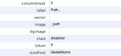
- columnbreak
0 or 1. Similar to menu columnbreak. Causes a new line in a horizontal oriented toolbar before the item is drawn. A new line starts with this item.
- label
The caption rendered underneath the Icon.
- image, bgimage
Tk images used as Icons. The »image« icon is layered in front of »bgimage« and partakes in colour changes, if it was created from bitmaps.
- token, vector, iconFont
The vector graphics for an item. »token« and »iconFont« define the glyph; whereas »vector« references a function, which will use the normal canvas (or TkZinc 3.3.6) primitives to create a vectorized icon.
It is possible to define all three icon types for a single item. »vector« is dominant to »token« and »token« is dominant to both foreground and background images.

The »-command« property common among all item types. The specified »command« will be invoked after the mouse-button was released.
There may be other toolbar types in the future without a »command« property.
Radiobutton Properties in Detail
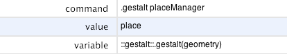
- variable
The variable monitored and maintained by this radiobutton. Any change of the value stored inside this variable will trigger a change in the radiobutton state ( selected / unselected ).
- value
The supposed true value for the given radiobutton. These value will trigger the selection of that radiobutton.
Checkbutton Properties in Detail
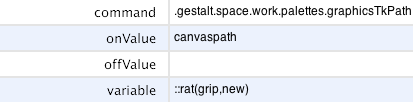
- onValue
The property »onValue« denotes what value »variable« will assume when the checkbutton is activated.
- offValue
Optional property.
The property »offValue« denotes what value »variable« will assume when the checkbutton is deactivated.