Yes, X Window System-menus can be striped!
The mechanism for striped menus is somewhat different to a normal window.
»stripesmenu« should be used for hijacking a menu. »stripesmenu« must be called in response to a »postCommand« event. It is recommended to even delay »stripesmenu« –make an asynchronous call.
»stripesmenu« requires the real visible menu window. If the menu is a child of a menubar then the »clone« is required by stripesmenu. The same applies for tear off menus and menubars, which are always clones.

Otherwise the mechanism follows the same pattern. There is no need for a template interface or variable w.
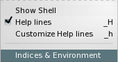
»stripesmenu« supports »compound«, but the defined images are always right aligned in the column, where the »accelerators« are normally displayed. The image is recessive to an accelerator –keyboard short-cut. It is also possible, recommended to replace the image with a »glyph«. The glyph is defined as a substitute for the image by using the »glyphfont« Option Database entry. A glyph will have the same size the menu entry itself has.
Example 6.28. Defining a Glyph
  # Declare thisFont as the
  # glyph font for all menus.
  option add *Menu.glyphfont thisFont

  # An empty image.
  image create bitmap mynil;

  # Substitute mynil with a glyph from thisFont.
  option add *Menu.mynil K

   .menu add command \
      -compound right \
         -label "My Image" \
         -image mynil
Images are recessive to glyphs and both are recessive to keyboard short-cuts. Images occupy the same area as short-cuts.
The proper mechanism for compound inside of menus would show images or glyphs only if they are visible inside the Graphical User Interface. The available information is currently insufficient to implement this.
»activeImage« and »disabledImage« can be used inside of menus, too. Since the Option Database can’t be used to predefine menu entry attributes: the naming convention for these images are derived from the original image name.
Non-Space Image Names
Don’t use space characters inside of image names when used in menu entries! These names cannot be used for X Resource Database compliant resources.
Example 6.29. Active and disabled Images
menu .my
.my add commannd -image mg
option add *my.activeImagemg actmg
option add *my.disabledImagemg dismg
The design for checkbutton and radiobutton entries is identical to their dialog equivalent, when »indicatoron« is set to »1«.
There is however one difference: The check and radio -mark change their colour when active.
Menu entry colour definitions are ignored, except for »-foreground«. The menu’s colours are used instead.
There is some special code for short-cuts. This code is currently deactivated. The goal is to always display accelerator as single keyboard keys.
Example 6.30. Keyboard keys and Accelerators
  A ➟ [Shift-Symbol]A
  a ➟               A

  Control-A ➟ [Shift-Symbol][Control-Symbol]A
            ➟ ⇧^A
See the source code gstripesmenu.tcl
for a detailed overview concerning keyboard keys.
Additional Option Database entries
- borderColor, borderOpacity
These two properties define the appearance of the tearoff indicator and the menu border.
- disabledForeground
Apart from its conventional usage: disabledForeground is also being used to draw the »separators«.
- keyboardfont
Not used!
- glyphfont
The font containing the glyphs for substituting compound images.
The Menu property »activeBorderWidth« and the new Option Database properties »radius«, »activeBorderColor«, »activeBorderOpacity« and »stripes.activeSelectColor« can be used to fine-control the displayed selection inside of a menu.

»activeSelectColor« is a property of the Gstripes window and not the menu. This property accepts gradients created with »tkpath::gradient«. Use it to create sunken selections.
Design Blooper: Raised Selection
Do not use »raised« gradients to represent selection!
Jumping Buttons occur in some environments. Avoid jumping buttons, if possible. A solid colour is a safe approach for menu selection.