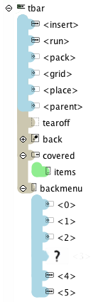
The Goolbar design is inspired by the menu interface. This guarantees an easy implementation –close to every application features a menu. The Goolbar has commands, checkbuttons, radiobuttons, separators and one variable space. There is one major difference to Tk menus: The goolbar items have explicit names –specified during instantiation.
Toolbar items may be visible or invisible. Visibility is controlled by the Goolbar »-show« property. Suppose there are four items inside the Goolbar named »a«, »b«, »c« and »d«; in this situation all items will be initial visible. Right after they were added to the Goolbar, unless »-show« was specified prior to the add commands.
Example 2.3. Visible and Invisible Items
# Create the toolbar without specifying
# show makes all added items visible.

.toolbar add command a …
.toolbar add command b …
.toolbar add command c …
.toolbar add command d …
…

# Example hide d – and add variable space (~)
.toolbar configure -show {a b ~ c}
A Goolbar item always contains a caption. The exceptions are variable space and separators, were the caption is usually suppressed.
A caption is specific for an item and defined through the item´s »-label« property.
Captions are also provided for embedded windows or vectors.
Item properties cannot being specified via the option database – again the same as with menu entries.
All Items expect and support Tk images. There are two varieties for images: foreground and background images. The foreground image is dealt with in an unusual way. The foreground should be a bitmap based image; in this case a private copy of the image is being made and used by the toolbar. This image partakes in active foreground colour changes; reflecting interactive states within the visible icons themselves.
The second, less important image is the background image. The background image is placed underneath the foreground image and remains unmodified.
Example 2.4. Foreground and Background Image
.toolbar add iconsFB \
     -image foreground_image \
   -bgimage background_image …
Traditionally, icons are supposed to be bitmapped pictures. The Goolbar supports two additional, vector-based types (Zoolbar a third).
A glyph is the representation of a character inside a font. This glyphs are being used by the Goolbar to create very fast vectorized icons –with anti-aliasing and a low memory footprint as a bonus.
Glyphs are specified through the »token« and »iconFont« item properties. The token references the glyph in the defined icon font, multiple glyphs are allowed.
The Goolbar is based on Tk’s Canvas window (Zoolbar Goolbar’s stepbrother is based on Zinc). It’s possible to use every canvas graphical item, or combination thereof, as an icon.
A vector is implemented in a Tcl procedure, which will be made known to the Goolbar item through the »vector« property. These function need not to return the ID of the new item.
Vector procedures have to follow a certain signature to be used as such from within a Goolbar.
Signature details
- canvas
The first parameter »canvas« is the drawing window inside the Goolbar.
- tags
The required tags for the new–to be created– vector item.
The provided »tags« are used to manipulate and identify the item, to which the vector belongs.
When using groups under TkPath 0.3, only assign these »tags« to the main group of the created vector and not to its elements.
- x, y
The coordinates where the new vector icon is to be created. The used anchor is »s« (south).
- size
The dimensions of the new vector icon.
The size value originates from the »vectorsize« Goolbar property.
Use the following formulas to convert real canvas coordinates into vector size:
Example 2.6. Lisp Code to calculate Vector Icons
;; Y-Position
(* (/ (- bottom y) (- bottom top)) 1.25)

;; X-Position
(/ (- x (* 0.5 (+ right left))) (- right left))
Bottom, top, left and right in Example 2.6, “Lisp Code to calculate Vector Icons” are either the outer coordinates or the
bounding box around all elements inside this vector.
The vector formula is Lisp-Code.
Using TkPath 0.2 transformation inside a vector is a rather bad idea. Specifically avoid rotations. Best practice: first design the vector, then convert rotated items to path.
With TkPath 0.3 use a basic group without transformations, transformations are then usable for the items inside of it.