The typical interactive controls from Tcl/Tk can be hijacked under X Window System when TkPath and CAIRO® are present. Active controls are left alone by Gstripes under AQUA® and Microsoft-Windows®. However Gstripes can be forced to hijack active controls under AQUA® and Microsoft-Windows®.
This section is dedicated to X Window System, with the exception of groups.
Controls are ignored by Gstripes whenever »compound« is defined. Stand alone checkbutton and radiobutton with »indicatorOn« turned off (0) are ignored, too.
A hijacked control does not automatically receive change events for properties. Make sure to inform the Gstripes window after such a change has occurred. This is very important for »state« changes. See also Example 6.26, “Modifying hijacked windows”.
Call »modified« with the window path in question after a property has changed.
Example 6.9. Notify about modified Property
# Be aware path names are truncated!
.mywindow configure -state disabled
.mystripes modified .mywindow
Not all Tcl/Tk properties are meaningful in the context of Gstripes. Hence some properties are ignored. These properties are mostly relicts, or constitute design problems.
The overall Gstripes design follows the Tcl/Tk design from version »8.0«.
Ignored Properties
- anchor
The anchor properties is an anachronism; predating the »grid« geometry manager. Make »grid« the default geometry manager. And use »pack« for ragged layouts alone – don’t design exclusively with »pack«!
- bitmap
Bitmap is a historic relict, too. But might still being used in some situations. If possible, use a font glyph to replace a bitmap. Otherwise, generate an image from the bitmap and put this image on the control.
Example 6.10. An Image from a Bitmap
image create bitmap imagefrombitmap \ -forground black \ -background white \ -file »path to the bitmap« \ -maskfile \ »path to a background bitmap«- cursor
Not possible.
- highlightBackground
Not needed.
highlightBackground is required by Tk controls to create white space around the visual border of said control. A hijacked control directly interacts with the white space created through the Gstripes window. The highlight area is simply yielded to the Gstripes window.
- relief
Done inside the control through a gradient and a solid border (with »borderColor«).
Please send a use-case to me, if you think there is a need for »relief«.
- overRelief
OverRelief is used to mimic toolbar items with buttons. Use the Goolbar instead.
This feature is whimsical and better avoided at all.
OverRelief can be implemented with Gstripes, too. A plain colour is needed as the predefined gradient for the control in question. Also set the »opacity« of that control to a very low value, for example: »0.01« (some background should better be present).
Now, whenever the mouse-pointer enters the control, then »activeBackground« replaces »background« as its colour. The control fades back into white space after the mouse-pointer has left it.
The above substitution requires TkPath 0.2, and can’t be used with a Zoolbar.
Recommendation: Don’t use the substitution either!
- compound
Gstripes ignores any control with »compound« set.
I intend to implement compound, but skipped it first due to technical, and later for design reasons, too. Gstripes may support »compound« for buttons in the future.
- underline
Mnemonics in Tcl/Tk.
There is no substitution for mnemonics, right now!
The implementation of »underline« would require an unwarranted effort. A successor to mnemonics is conceptional complete and partially implemented.
Any Tcl/Tk button window can be hijacked by Gstripes.


A button is represented by a rounded shape, 1-third of its height. If there is more than one text character on it.
The button will have a square shape (not rounded), if there is only a single character on it — a glyph— or when an image is used.

The button shape is customizable from within the Option Database; use the »radius« property to do so.
Example 6.11. Redefine Button Radius
# Be aware: the path names are truncated!
option add *mybutton.radius 8
.mystripes hijackwindow .mybutton
A button must not contain multiple lines (Newline-characters).
Unsupported button properties
- justify, wrapLength, padX, padY
Multi line text isn’t supported and consequently neither is »justify« nor »wrapLength« required.
The »text« property is recessive to »image«.
Additional Option Database properties
- activeImage, disabledImage
These properties are used in conjunction with the »image« property. »activeImage« is used whenever the cursor is inside the control. The control is in state active.
»disabledImage« is used instead of »image« when the control is disabled. The control is inert.
- borderColor
The border width is derived from the »borderWidth« property.
- radius
Radius of the control's shape.
Don't modify the radius property for stand alone buttons!
- defaultFrame
Dimension for the highlight frame around a »default« button. The unaltered dimension is 5 pixel.
A default button has the permanent state »active«.
- selectColor
Colour for the »defaultFrame«. A sunken gradient will be created around and below the button using »selectColor«.


Custom Shapes in Version 1.1
A new Option Database property ».boundariesVector« is introduced in version 1.1. »boundariesVector« allows arbitrary shapes for any menubutton or button. The default rectangular shape is defined in the vector: »gstripesvector::vanilla«.
»vanillaOK« and »vanillaESC« are additional predefined vectors, these two vectors are reserved for interactive help desk operations and shall not being used as regular Graphical User Interface elements.
The Option Database properties »emphasis« and »emphasisVector« can be set and combine multiple vectors for a single control. The »emphasis« property expects a boolean value activating the emphasisVector.
The default emphasisVector
is ::gstripesvector::emphasis.


A menubutton is visually similar to a button. It displays a slightly rounded (4 pixel) shape with a sunken menu indicator to the right.
A menubutton has a square shape with only a single character as text.
There is a bug with the hijacked menubutton and menus: a posted menu can’t be closed by clicking outside the menu. Use the escape key instead.
Unsupported Menubutton Properties
- justify, wrapLength
Multi line text isn’t supported and consequently neither is »justify« nor »wrapLength« needed.
- image
Images are not supported for menubuttons. Not even inside a group!
- indicatorOn
The property »indicatorOn« is ignored for menubuttons and »on« is assumed.


Checkbutton and radiobutton have two distinct visual representations. The representation with indicator is described here. The non-indicator variety is only permitted for grouped controls.
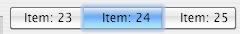
The indicator of checkbutton and radiobutton is an icon, representing the normal form of a checkbutton or radiobutton. The normal form of checkbutton and radiobutton is identical to that of a button, except that their state is revealed by a depressed representation and / or a distinct colour change. The normal form, of checkbutton and radiobutton, appears inside of groups . Example for such a radiobutton groups, can be seen under AQUA®, were it’s common for constructing tabsets. Radiobutton and checkbutton groups are nowadays supported by all major windowing system including Microsoft-Windows®.
A radiobutton or checkbutton with an indicator is being used for stand alone controls. The entire body of the control fades into the surrounding white space , except for the indicator.
Custom Indicators in Version 1.1
Indicators are definable for individual checkbuttons, radiobuttons and menus. Use the Option Database property »indicatorVector« to defined an individual indicator.
A predefined vector »triangleButton« is distributed with Gestalt Items. »triangleButton« is intended as an indicator for checkbuttons performing visual disclosure. The indicator »triangleButton« still adheres to the previous definition of an iconic representation.
»indicatorOn« is required! Otherwise the control is ignored.
»compound« must be »none«! Otherwise the control is ignored.
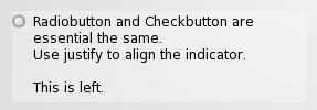
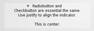
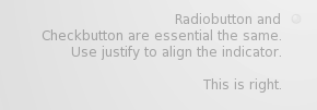
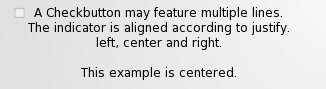
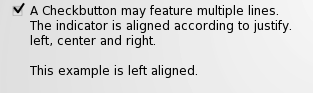
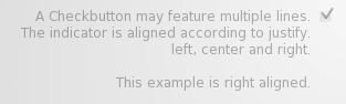
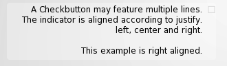
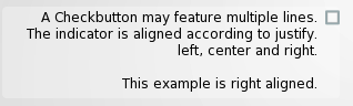
A hijacked checkbutton features an indicator and multi-line text. The indicator position is determined by the »justify« property. That is: the text will be aligned according to »justify« and the indicator placed at the beginning or end of the first line.
Radiobutton and checkbutton, with indicators, are conventionally left aligned. Aligning the indicator with the text keeps the indicator together with its caption.
The indicator is aligned to the outer border of the control, with a distance of »highlightThickness«.
An right aligned indicator is slightly moved to the left. The adjustment is controlled by »padX«, which is otherwise ignored. This makes it possible to keep the check mark inside the boundaries of the control.
Set »padX« to 0 (zero), in order to align right justified checkbuttons with other right aligned controls. Note: The check mark might exceed the control’s boundaries!
Checkbuttons and radiobuttons fade into white space. Only the indicator remains opaque, featuring the background colour.

Use »modify« after state or property changes.
Example 6.12. Radiobutton State Changed
   # Be aware path names are truncated!
   set myvariable 0
   radiobutton .myradio \
              -variable ::myvariable \
                 -value 1

   ...
   set myvariable 1
   .mystripes modified .myradio
Groups are not entirely new to Tcl/Tk. The property »indicatorOn« set to off features a group like appearance for checkbuttons and radiobuttons, from the infant age of Tcl/Tk onward.
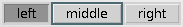
It was however never combined into a single control. Which is the clear purpose of groups.

A group is defined through the group leader. The group leader is the left-most item inside a group. It doesn’t matter where the group leader appears in the group definition! The group will be sorted left oriented.
Example 6.13. Making of a Radio group
   # Be aware window path names are truncated!
   radiobutton .radioa
   radiobutton .radiob

   # On screen
   grid .radioa -column 0 -row 0 -sticky news
   grid .radiob -column 1 -row 0 -sticky news

   # Stripe the parent window of radioa and b.
   gstripes .stripes

   ...
   # Somewhere else in response
   # to Map and Configure Events:
   .stripes hijackwindow {.radioa .radiob}
A group may contain buttons, menubuttons, radiobuttons and checkbuttons. It is possible to mix this various controls within a group. Recommendation is not to mix various control types inside a single group.
Any item inside the group will answer to the before mentioned restrictions. That is single line, no compound.
Checkbutton and radiobutton will accept »image« and »selectImage« and through the Option Database also »activeImage« and »disabledImage«.
The menubutton has some extra appearance inside of a group: it is the only control which pertains an indicator. Images are not supported for menubuttons.
A group should feature a certain radius to better communicate its function through its shape.
Radius for Groups


The group members do not longer exist as singular controls and thus have to answer to the group design. Disabled controls will not fade into white space. And the background colour is defined through the group leader and not the individual member!

In Tk, windows can act as managers for their sibling windows.
Example 6.14. Sibling Management
toplevel .top
frame .top.sib
button .top.b1
button .top.b2

# The frame sib manages button b1 and b2!
pack .top.b1 -in .top.sib
pack .top.b2 -in .top.sib
Whenever the window hierarchy differs from the management hierarchy as is shown in Example 6.14, “Sibling Management”, »update idletask« must be called before the proper coordinates of each group member can be retrieved. This is done by defining the »update« property inside of the Option Database for the first group item.
Also hijack the container of such a sibling managed group!
Example 6.15. Hijacking sibling groups
... make a stripes window ...

# Make the container invisible and hijack it:
option add *top.sib.borderOpacity 0.0
.top.stripes hijackframe .top.sib

# Make sure »update idletasks« is called
#  before retrieving the group coordinates.
option add *top.b1.update 1
.top.stripes hijackgroup {.top.b1 .top.b2}
Tcl/Tk under AQUA® displays groups the same way as under X Window System. Gstripes groups do close a visual gap under AQUA®
The AQUA® gradients inside Gstripes are colour independent. That is, each background colour can be used with these gradients. For every target colour a coloured gradient is being created and cached inside a local storage. Previous gradients are being reused whenever possible. For TkPath 0.3 a cache is kept for each canvas window –with 0.2 a global cache structure.
Buttons, radiobuttons, etc. under AQUA® feature a sophisticated multi-colour background. Gstripes is able to work with sophisticated multi-colour gradients. All, that is required, is to replace the cached gradients for a distinct colour through a pre-defined, hand-crafted gradient.
Predefined gradients can be used with TkPath 0.2.4 to 0.2.8, only.
The Figure 6.39, “Hand-crafted Gradients under AQUA®” features hand-crafted gradients, stored inside the Gstripes gradient cache. The exact gradients are presented in Example 6.16, “Manipulating The Gstripes Cache”.
Example 6.16. Manipulating The Gstripes Cache
This example requires TkPath 0.2.4 to 0.2.8! It can't be used with TkPath 0.3!
# The conventional background colour is "gray93":
set ::gstripes::_normal(gray93) \
[tkpgradient xxx create linear  \
                        -stops {
 {0 #dddddd}     {0.01 #fdfdfd}  {0.08 #fdfdfd}
 {0.09 #f7f7f7}  {0.26 #eeeeee}  {0.4 #ebedeb}
 {0.41 #dfdfdf}  {0.509 #e2e2e2} {0.51 #e4e4e4}
 {0.64 #efefef}
 {0.76 #f9f9f9}  {0.99 #ffffff}  {1 #d7d7d7}} \
             -lineartransition {0 0.0 0 1.0}];

# This is another colour, used as a place-holder,
# in this case checkbutton indicators.
set ::gstripes::_pressed(#b03060) \
[tkpgradient xxx create linear  \
                        -stops {
 {0 #dddddd}     {0.01 #e1e9f7}  {0.08 #e1e9f7}
 {0.09 #caddf2}  {0.26 #9cc3ec}  {0.4 #71acee}
 {0.41 #71acee}  {0.42 #599aed}  {0.5 #5396ef}
 {0.64 #71b2ff}
 {0.76 #9ad5ff}  {0.99 #aee9eb}  {1 #a2d6d7}} \
             -lineartransition {0 0.0 0 1.0}];

# The selection Colour under AQUA.
set ::gstripes::_normal(#62aaf6) \
   $::gstripes::_pressed(#b03060)

set ::gstripes::_pressed(#62aaf6) \
   $::gstripes::_pressed(#b03060)
AQUA® Compliance
The presented »selectColor« in Example 6.16, “Manipulating The Gstripes Cache” and its newly associated gradient do not match the AQUA® colour exactly. The normal »gray93« background however is very close indeed.
Predefined gradients requires TkPath 0.2.4 to 0.2.8.
Gstripes is used for the Rtl_combobox, Rtl_gridwin focus frames – fading into white space, and groups under AQUA®. Avoid using menu buttons inside of groups, because the displayed indicator won’t match that of AQUA®.
Avoid using images inside of groups under AQUA®. Controls holding images do have unexpected side-effects under Tk-AQUA®. Best Practice: Use font glyphs as icons inside of groups.
The Gstripes features »shadows« under AQUA®. The »shadow« is controlled by »shadowWidth« and »shadowOpacity« for a group leader. The normal shadow is designed to work well under AQUA®. The Gistbox button group does not feature a shadow, though. The shadow is disabled by setting its »shadowWidth« to »0«.